Components
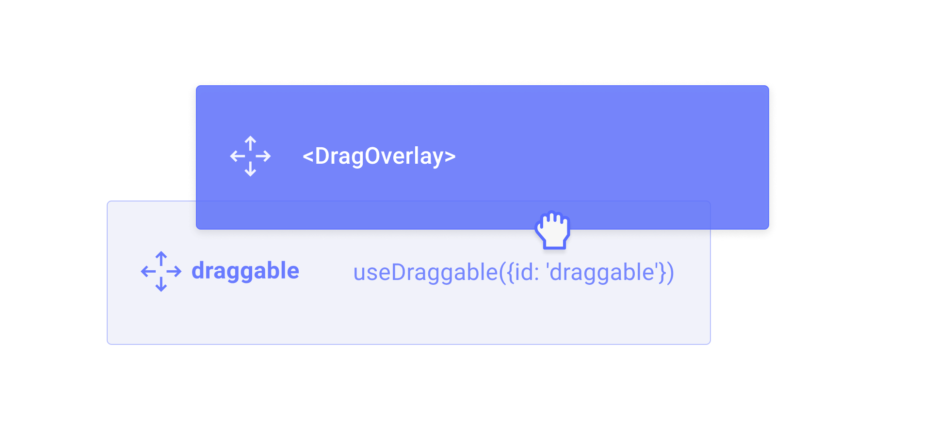
DragOverlay
Render a custom element as visual feedback during drag operations.
Overview
The DragOverlay component renders a custom overlay element while a drag operation is in progress. This allows you to display a completely different element than the one being dragged, which is useful for rendering a styled clone, a preview, or a simplified representation of the dragged element.
Usage
Import and place the DragOverlay component inside a DragDropProvider. Its children will only be rendered when a drag operation is active.
<script>
  import {DragDropProvider, DragOverlay, createDraggable} from '@dnd-kit/svelte';

  const draggable = createDraggable({id: 'my-item'});
</script>

<DragDropProvider>
  <button {@attach draggable.attach}>draggable</button>
  <DragOverlay>
    {#snippet children(source)}
      <div>I will be rendered while dragging...</div>
    {/snippet}
  </DragOverlay>
</DragDropProvider>
You should only render the DragOverlay component once per DragDropProvider.
Rendering based on the drag source
You can use the children snippet parameter to access the current drag source and render different content depending on which element is being dragged:
<script>
  import {DragDropProvider, DragOverlay} from '@dnd-kit/svelte';
</script>

<DragDropProvider>
  <!-- draggable elements -->
  <DragOverlay>
    {#snippet children(source)}
      <div>Dragging {source.id}</div>
    {/snippet}
  </DragOverlay>
</DragDropProvider>
Customizing the drop animation
By default, when a drag operation ends, the overlay animates back to the position of the source element. You can customize or disable this animation using the dropAnimation prop.
<!-- Disable the drop animation -->
<DragOverlay dropAnimation={null}>
  {#snippet children(source)}
    <div>No animation on drop</div>
  {/snippet}
</DragOverlay>

<!-- Customize the animation timing -->
<DragOverlay dropAnimation={{ duration: 150, easing: 'ease-out' }}>
  {#snippet children(source)}
    <div>Fast drop animation</div>
  {/snippet}
</DragOverlay>
Props
Whether the drag overlay is disabled. When true, the overlay will not render its children during drag operations.
Customize or disable the drop animation that plays when a drag operation ends.
undefined– use the default animation (250msease)null– disable the drop animation entirely{duration, easing}– customize the animation timing(context) => Promise<void> | void– provide a fully custom animation function
Snippets
The content to render as the drag overlay. Only rendered when a drag operation is in progress.
Snippet parameters:
source– the Draggable instance that is the source of the current drag operation.